
Case study 01 · HubSpot · APRIL 2025 → Present
HubSpot for Google
Sheets
How I designed a new AI-powered distribution surface that meets spreadsheet users where they live, and earns its way into HubSpot.
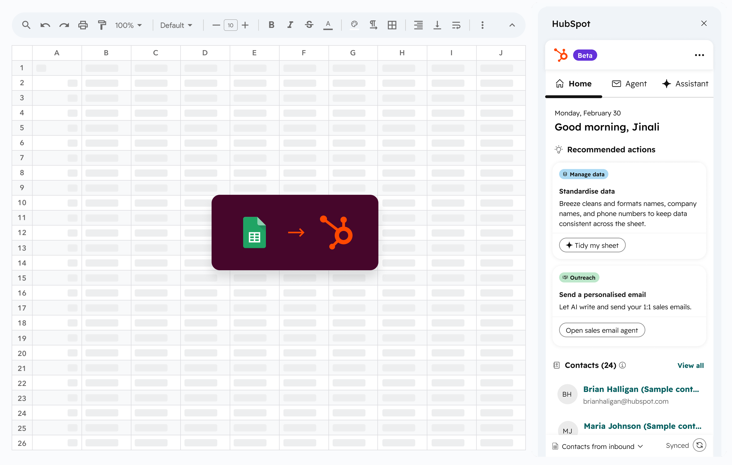
When I joined the project, we were a small team with a big ambition. The brief sounded simple: build a Sheets add-on. But the real question underneath it was harder.
before it ever asks someone to buy a CRM?
This is the story of how we answered that question.
HubSpot's growth engine ran on organic search, and that model was breaking down: AI Overviews cut organic click-throughs by 58%, and HubSpot's top-of-funnel demand dropped 6.5%.
Competitors and niche add-ons were mopping up demand inside the Google Workspace Marketplace while HubSpot waited for people to find us. We needed a front door that lived where our users already spent their days.
The question wasn't how to fix the search funnel. It was how to be in the room before anyone started searching.

The first version of the add-on was functional but directionless: a CRM connector that imported contacts and displayed them in a sidebar. It worked. But usage was one-off and migration-oriented. People came, imported, and left. We weren't part of anyone's daily workflow.
Why are we asking people to bring their data to HubSpot when we could bring HubSpot to their data?
The QUESTION
That question turned a migration tool into a daily workspace. Instead of "leave Sheets for HubSpot," we were building a sidekick that added value to the workflow founders were already living in.
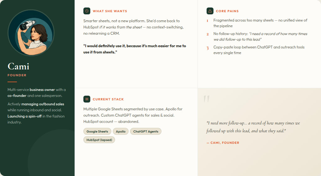
We tried other CRMs, but we found it too complex to manage day-to-day. So we switched back to spreadsheets.
- James R · Early-stage founder

I led user research with early-stage founders actively managing sales pipelines in Google Sheets. Through interviews, usability sessions, and behaviour analysis, we uncovered why founders stay in Sheets - and what it would take to graduate them to HubSpot.
Trust and familiarity.
Sheets is familiar, flexible, and just works. They've built their business on it. Switching feels risky.
The value gap.
They want CRM capabilities but can't justify migration time or learning curve while wearing ten hats.
A daily command centre.
The spreadsheet is where the day happens. Pulling them out breaks flow - they're in it 10+ times a day.
Graduation triggers.
Considered when teams pass 3–5 people, pipeline crosses 20–30 deals, or follow-ups slip.
I don't have anyone I can ask, 'what should we do today?' Finding that assist that actually tells me, 'you've been contacting these people for a while,' or 'have you thought about doing this?' - that will make me use it every day.
- Alex S · Co-founder, HubSpot for Sheets beta participant
A Google Sheets sidebar gives you 280px of horizontal space. No modals. No full-page takeovers. Every interaction has to earn its place.
Earn the sidebar.
280px of horizontal space. No modals. Every interaction had to deliver value before asking for any commitment.
Meet the workflow.
No data migration, no switching, no new tool to learn. The AI reads the sheet and suggests the next best action.
A graduation path.
Deal tracking, task management, and full HubSpot features unlock as founders grow - not as a paywall.
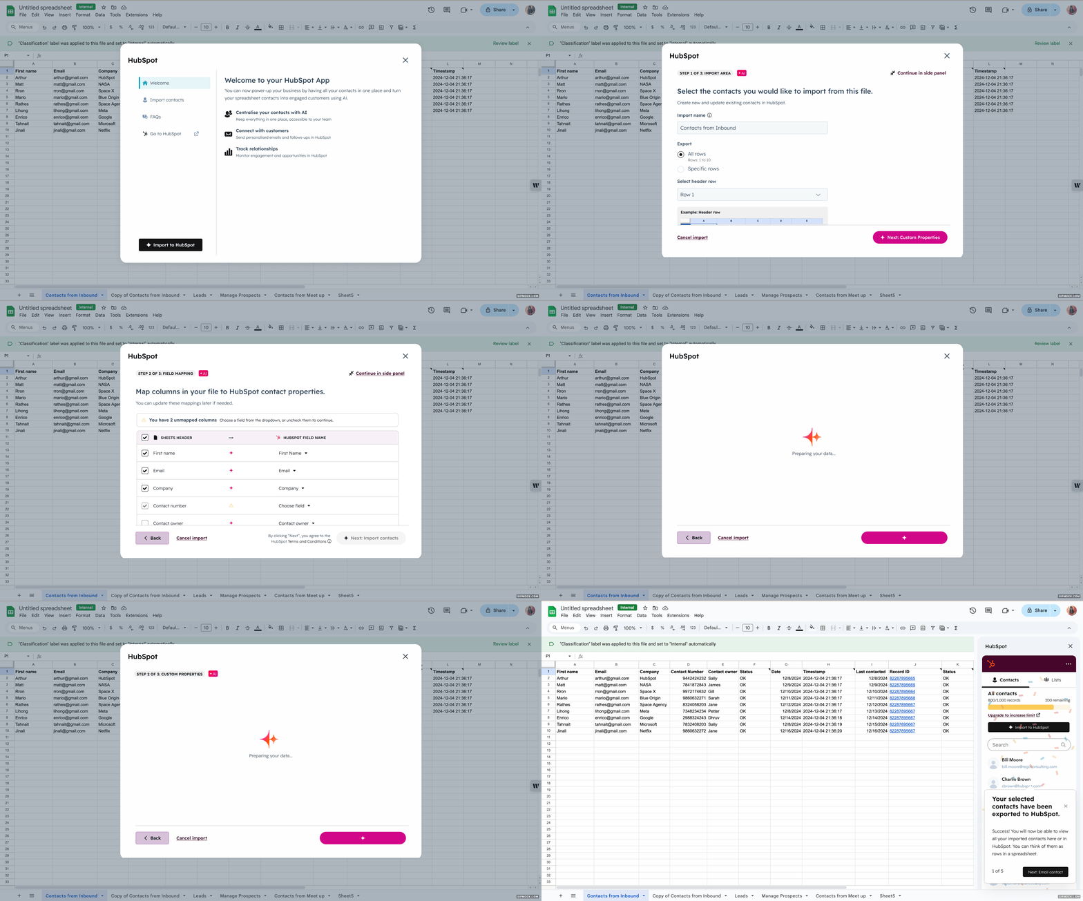
The original onboarding opened a welcome modal with an ‘Import contacts’ button. During user testing 7/10 users reflexively closed the modal entirely, and the modal had a multi-second loading delay on Apps Script that engineering couldn’t fix at the platform layer. We replaced it with a sidebar welcome screen that runs the contact sync in the background. 97% of users who reach activation get there because the product promises value the moment the sidebar opens.
Before
Brewing something good...

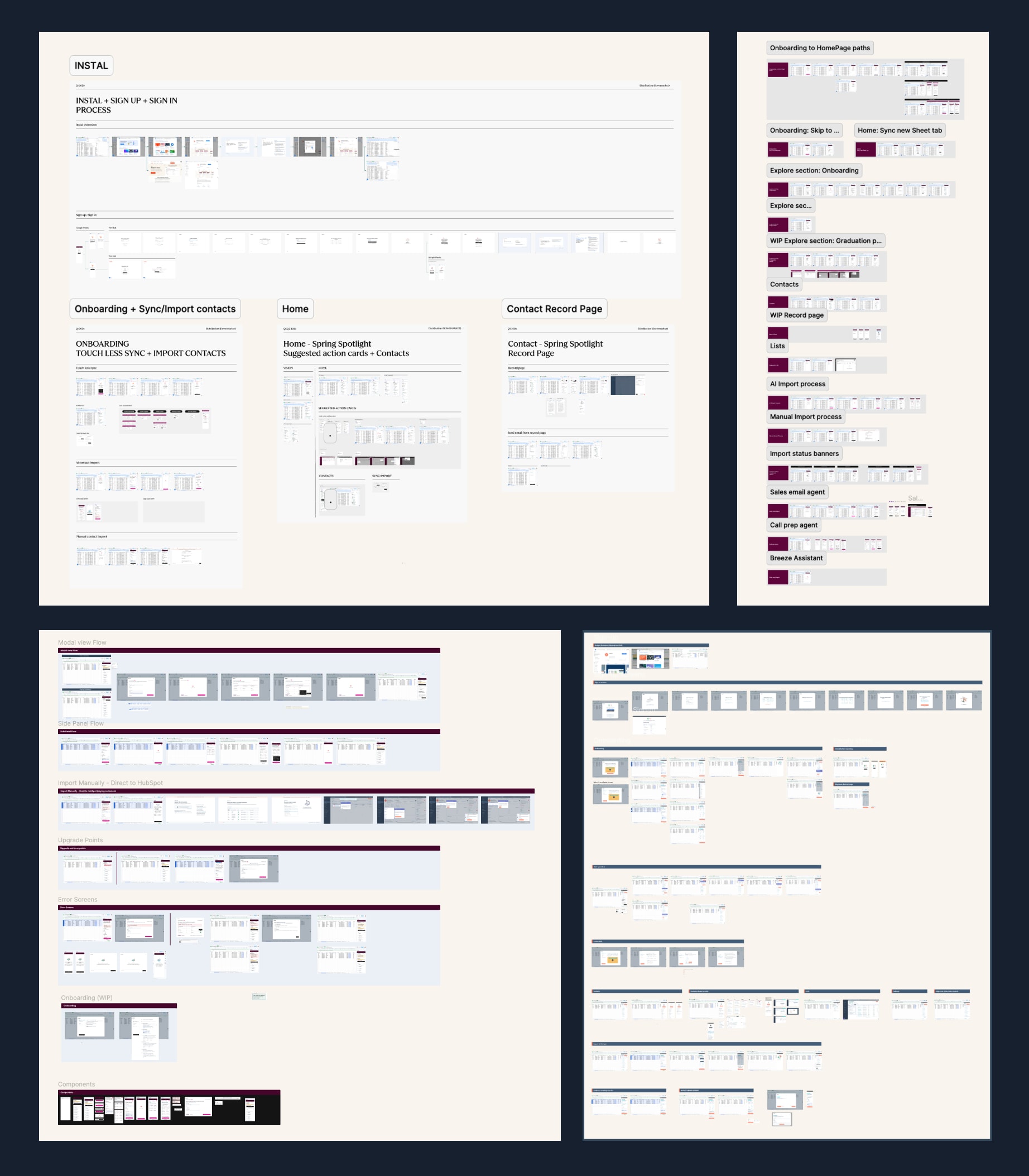
Sheets is a platform with rules. Every decision in the product either fit the rules or worked around them. Eight constraints shaped the work. Here is the design decision that came out of each one.
Platform limits
These are constraints from what Apps Script and Google Sheets could and couldn’t do.
| # | The constraint | Design decision |
|---|---|---|
| The constraint Google’s Apps Script platform doesn’t let us check for new data in real time. Hiding this would have led users to trust data that was silently stale. | Added a refresh button in a fixed location and a “Last synced 2 min ago” label on every record. The limit is named on the screen. | |
| The constraint Users asked for two-way sync between Sheets and HubSpot. Apps Script couldn’t poll fast enough to make it reliable. | Two-way sync that broke half the time would have been worse than one-way sync that worked all the time. We shipped one-way, with HubSpot as the source of truth and a manual refresh in the sidebar. | |
| The constraint The first version opened the experience in a modal over Sheets. The modal covered the user’s data and took over 10 seconds to open or close inside Apps Script. | Dropped the modal entirely. The sidebar is the only surface. Data stays visible, and the sidebar opens in under a few seconds. | |
| The constraint A Sheets workbook can have multiple tabs, and Apps Script can’t detect when the user switches between them. Users imported one tab, switched to another, and lost track of which data was synced. | Built a tab indicator inside the sidebar that names the active tab and the recommendations tied to it. Changing the tab in the sidebar moves the Sheet to that tab. The reverse isn’t possible on the platform, so the sidebar indicator is the source of truth, and the limit is named on the screen. |
Real-world deployment
These are constraints from how users actually run their browsers and how the product loads in the field.
| # | The constraint | Design decision |
|---|---|---|
| The constraint The AI mapper reads the entire sheet for context, which takes 3 to 5 seconds. The import primarily benefits HubSpot: it is how HubSpot builds recommendations later, not something the user sees value in yet. A loading screen would have asked users to wait for something they didn’t yet care about. | Hid the import behind touchless sync. It runs in the background while the user moves through the next onboarding step. Users reach a working sidebar without sitting through a loading screen. | |
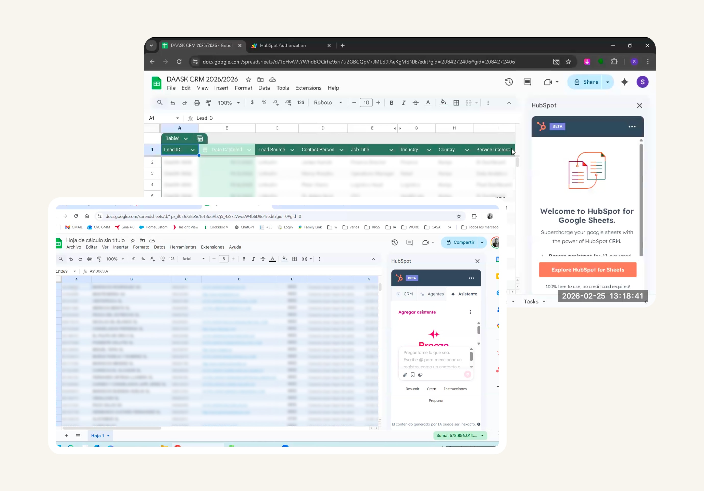
| The constraint Most users zoom their browser to 110% or 125% by default. Inside Sheets, that shortened and narrowed the sidebar. The top-tab nav clipped off-screen, and the visible area shrank to where every pixel mattered. | Designed while keeping in mind these edge cases, making sure every pixel matters. |
User language and flow
These are constraints from how users described the product and what they needed to move through it comfortably.
| # | The constraint | Design decision |
|---|---|---|
| The constraint Legal required three acceptance moments: HubSpot’s sign-up terms, beta program terms, and AI data consent for Breeze. Stacking them as standalone screens would have added 3 friction points to a flow we had just shortened. | Folded each one into a moment the user was already paying attention to. Sign-up terms inside the OAuth grant. Beta terms inside the welcome state with a single accept button. AI consent inside the first Breeze action, with a tooltip showing what the AI sees. | |
| The constraint Users came with their own vocabulary. Column headers like “Cust ID” instead of “Contact ID,” or “Notes” instead of “Description.” The primary action in the flow had the same problem: 6 of 8 users heard “Export contacts” and thought they were sending data away from HubSpot, not into it. | Introduced custom property creation in the sidebar so sheet column names could carry through into HubSpot. Renamed the primary CTA to match how users described the action. Support questions about that step dropped after the rename. |
This was the first project where AI tools were a working part of my own process, not a feature I was designing for someone else. The result: I could run a full design cycle from research to hi-fi in days rather than weeks. And the product was better for it.
AI tool stack
Figma Make · Lovable · Hubbable · Claude Code · ChatGPT · Writer · NotebookLM
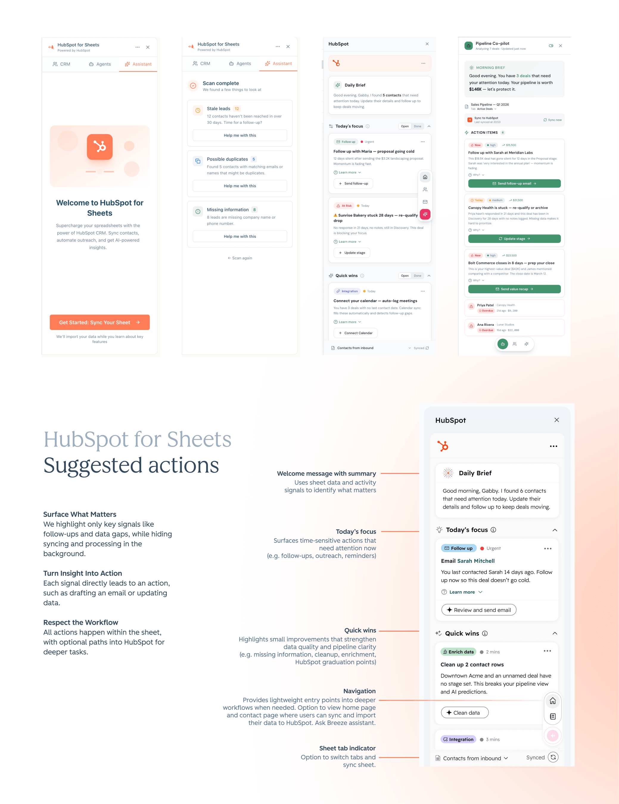
Lovable vibe code explorations that shaped the Design Vision.
With roughly 67% of users churning after a single session, the first five minutes in the sidebar needed to do significantly more. A single guided task would have addressed early churn before we had the data to prove it was a problem.
The wider lesson: when you're building a distribution product, activation isn't a metric to track after launch. It's the design brief from the first screen.